Clue: Redesigning for Retention
Redesigning Clue to Reduce Tracking Friction and Restore Trust in a Daily Health App

Overview
Clue is a menstrual health app designed to support cycle tracking, symptom logging, health insights, and reproductive education. Its premium tier, Clue Plus, is a key revenue stream.
This self-initiated redesign examined how the product could better support its most frequent user behaviours by reducing onboarding friction, simplifying symptom logging, and making premium prompts feel less disruptive within a sensitive health context. The work focused on clarifying product priorities: protect the core tracking habit first, then reposition monetization in a way that felt more supportive and credible.
Problem
Clue functions less like an occasional utility and more like a recurring personal health companion. Users open it frequently for quick, low-effort updates, which means even small interaction costs accumulate over time, especially when they interrupt a routine behaviour.
The app had previously moved free features behind a paywall. The response was swift and vocal: users flooded the App Store with complaints about perceived value loss, intrusive subscription prompts, and a daily tracking experience that felt more burdensome than helpful. At the same time, Clue Plus plays an important business role, so the challenge was never to remove monetization. It was to stop letting it overwhelm the primary reason users return.
Research & Discovery
I conducted a systematic review of App Store feedback, reading through a large volume of user reviews to identify recurring themes rather than isolated complaints. The patterns that emerged were consistent:
- Mandatory account creation before any meaningful use added friction at the worst possible moment, reducing the sense of immediate value
- Subscription pressure appeared too prominently at moments when users were trying to complete a core task, making the product feel commercial rather than caring
- The symptom logging flow required up to 29 swipes to complete a single entry, far more effort than a repeated daily habit should demand
- The home screen led with upsell content rather than the tracking features users came for
- Outdated UI patterns, crowded layouts, and limited symptom flexibility made the product feel less dependable than a health tool should
- Frequent crashes compounded the sense of decline in quality

Define
From the research, three core opportunities emerged:
- Reduce entry friction. The onboarding and home screen experience was optimized for conversion rather than for first use. Users who could not quickly access core features left before experiencing the product’s value.
- Restore perceived value in the daily tracking loop. The symptom logging flow was the app’s most-used feature and its biggest source of daily frustration. A faster, more intuitive logging experience would directly improve retention.
- Expand the product’s relevance. Adding pregnancy tracking would extend Clue’s value proposition to a broader set of user needs within the same product architecture.
How might we reduce the daily tracking experience to its essential interactions, so users can log symptoms quickly enough that it becomes a habit rather than an effort?
Ideation
I explored several directions for the logging flow:
- A card-swipe model that grouped related symptoms to reduce the total interaction count
- A floating action button that surfaced the logging interface from any screen in the app
- A slide-up overlay that made logging a contextual, interruptible task rather than a dedicated screen flow
For navigation, I evaluated reducing the number of bottom tabs and consolidating lower-priority sections to surface the features users returned to most frequently.
For subscription, I explored removing paywall prompts from the home screen entirely and relocating upgrade paths to moments where premium value was contextually relevant to what the user was already trying to do.


Decisions
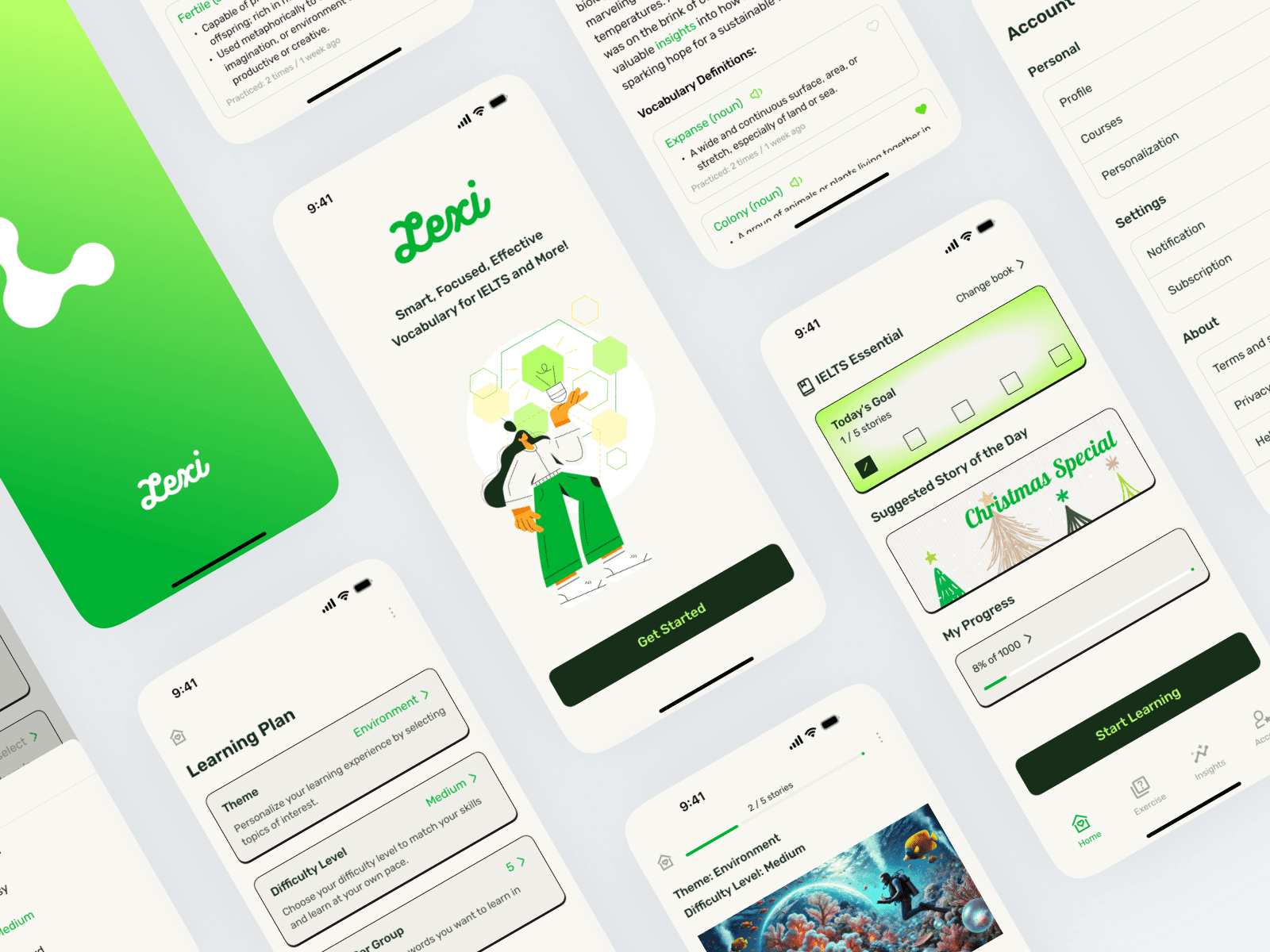
- Removed subscription upsell from the home screen. The entry experience now leads with tracking. Upgrade prompts appear at moments where premium features are directly relevant to the task at hand.
- Consolidated the symptom logging flow from 29 swipes to 3 taps and 1 swipe, by grouping symptoms contextually and relocating the recording function as a slide-up overlay accessible from any screen.
- Simplified bottom navigation to prioritize the Track feature and improve discoverability of secondary sections.
- Preserved the Content section as a trust anchor. Educational content is central to Clue’s credibility and sets it apart from simpler cycle trackers.
- Added a pregnancy tracking mode as an extension of the existing health tracking architecture, broadening the app’s relevance without fragmenting the experience.


Solution
The redesign addressed friction at three points in the user journey: getting started, logging daily, and deciding whether to subscribe.
The home screen leads with tracking access. The logging flow is a slide-up overlay that requires minimal interaction to complete. Navigation is simplified around the actions users perform most. Subscription upgrade paths are contextual, appearing where premium features are directly relevant rather than at every entry point.


Impact
- Prototype tested with real trial users via survey-based links
- Users reported improved ease of use and higher satisfaction with the simplified navigation and streamlined logging flow
- Testing validated that reducing onboarding and daily tracking friction meaningfully improves the overall experience
- The redesign demonstrated that addressing usability friction and sustaining a subscription revenue model are compatible goals; improving the free experience increases the perceived value of upgrading
Reflection
The most useful signal in this project came from public reviews rather than structured interviews. App Store feedback is unfiltered and specific in ways that survey data rarely is. Users describe the exact moment something frustrated them, which made it easier to locate the right problems quickly.
The more interesting challenge was the tension between business and experience goals. Clue’s monetization friction was real, but removing the paywall was never the answer. Making the free experience strong enough that users understood what they were being invited to upgrade from. Value has to be felt before it can be sold.