Olea: Product Foundations First, Brand Identity Later

Connecting investors, suppliers, and operations
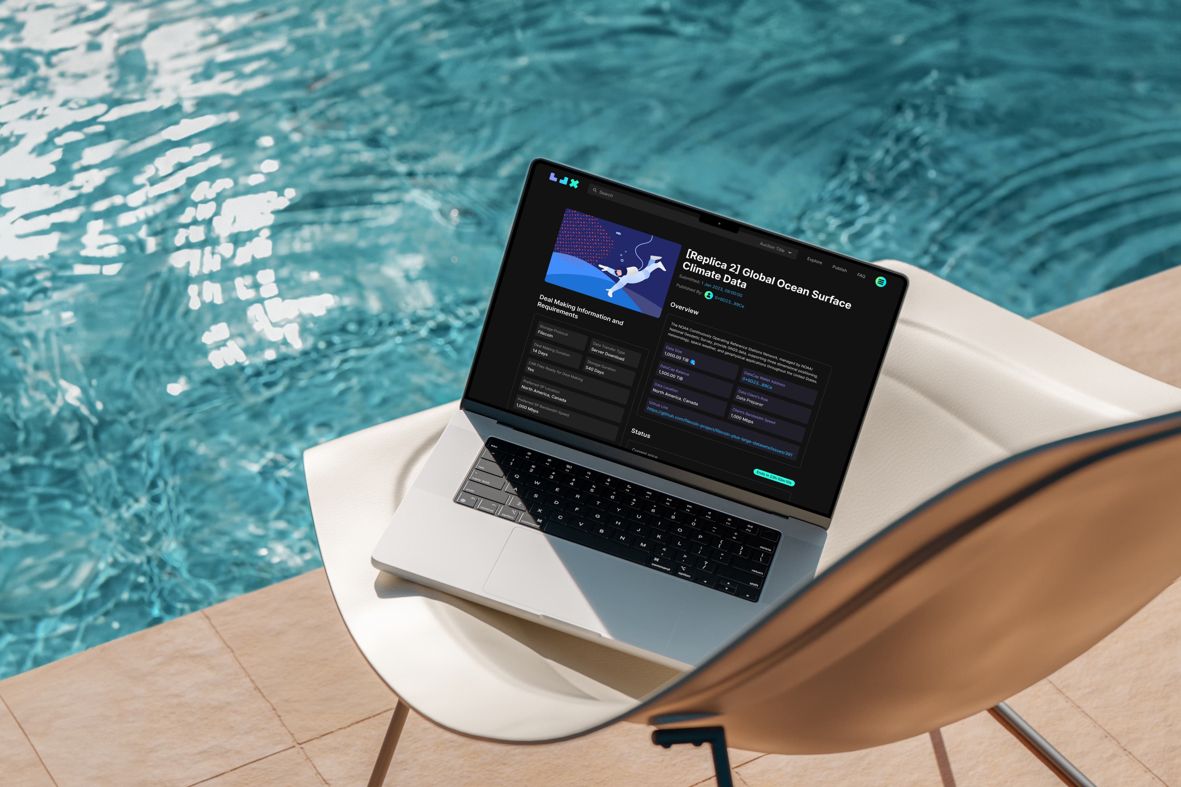
The platform launched in Asia’s manufacturing corridors, with expansion into the Middle East and Africa. Speed mattered on both sides: suppliers could miss working-capital windows while waiting for approval, and investors needed to judge risk quickly.
Three portals addressed these needs:
- Investors: reliable data to evaluate opportunities and monitor risk.
- Suppliers: guided financing and repayment workflows.
- Internal operations: secure tools connecting both sides.
I worked with product, engineering, and business teams in a co-located office, with senior leadership reviews every two weeks.

Move early without creating expensive rework
There was no logo, palette, or visual direction. Waiting would have delayed the customer-facing portals, which needed the most design, review, and testing time.
Moving ahead carried its own risk. Fixing colours and styling across hundreds of screens could mean extensive rework once the brand arrived.
I treated the missing brand as a system architecture problem: establish what could remain stable, and make the visual layer replaceable in both design and code.


Four decisions that kept delivery moving
- Each portal got the level of custom design it needed. I owned the customer-facing Investor and Supplier portals, and designed the screen-heavy Internal portal with other designers on an established internal design system.
- Product structure and visual identity were treated as separate layers. Layouts, hierarchy, and workflows formed a stable foundation, with an interim institutional look on top until the formal brand arrived.
- Components were built around business behaviour. Trade cards, approval flows, data tables, and filters were shared across portals, and their styling could change without touching their logic.
- Colour roles came out of close work with engineering. Before Figma variables existed, we named colours by purpose in a shared reference, so engineers could map themes without reading individual mockups.


Impact and reflection
Designing ahead of the brand paid off. Stakeholders had production-ready customer-facing portals to review, and development was already underway when the brand arrived two months later. Applying it only touched the visual layer, and both portals gained light and dark themes without structural changes.
The lesson I carry forward: treat an undefined brand as a dependency to design around. Next time, I would test that separation in week one: apply a hypothetical palette to representative screens and verify that both the Figma system and front-end implementation could update colours globally.